A New Pantone Color Whose Courageous Presence Encourages Personal Inventiveness And Creativity.

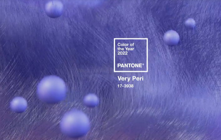
Displaying a carefree confidence and a daring curiosity that animates our creative spirit, inquisitive and intriguing PANTONE 17-3938 Very Peri helps us to embrace this altered landscape of possibilities, opening us up to a new vision as we rewrite our lives. Rekindling gratitude for some of the qualities that blue represents complemented by a new perspective that resonates today, PANTONE 17-3938 Very Peri places the future ahead in a new light.
We are living in transformative times. PANTONE 17-3938 Very Peri is a symbol of the global zeitgeist of the moment and the transition we are going through. As we emerge from an intense period of isolation, our notions and standards are changing, and our physical and digital lives have merged in new ways. Digital design helps us to stretch the limits of reality, opening the door to a dynamic virtual world where we can explore and create new color possibilities. With trends in gaming, the expanding popularity of the metaverse and rising artistic community in the digital space PANTONE 17-3938 Very Peri illustrates the fusion of modern life and how color trends in the digital world are being manifested in the physical world and vice versa.
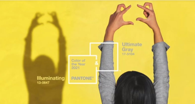
ANNOUNCING THE PANTONE COLOR OF THE YEAR 2021
PANTONE 17-5104 Ultimate Gray + PANTONE 13-0647 Illuminating
A marriage of color conveying a message of strength and hopefulness that is both enduring and uplifting.


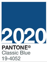
Pantone Color of the Year 2020
Classic Blue 19-4052
An animating and life-affirming coral hue with a golden undertone that energizes and enlivens with a softer edge.

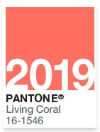
Pantone Color of the Year 2019
Living Coral 16-1546
An animating and life-affirming coral hue with a golden undertone that energizes and enlivens with a softer edge.
Explore Living Coral 16-1546 >

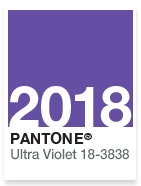
Pantone Color of the Year 2018
Ultra Violet 18-3838
A dramatically provocative and thoughtful purple shade, PANTONE 18-3838 Ultra Violet communicates originality, ingenuity, and visionary thinking that points us towards the future.
Learn More >

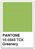
Pantone Color of the Year 2017
Greenery 15-0343
A refreshing and revitalising shade, Greenery is symbolic of new beginnings.
Learn More >

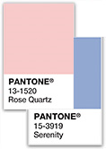
Pantone Color of the Year 2016
Rose Quartz 13-1520 & Serenity 15-3919
A softer take on color for 2016: For the first time, the blending of two shades – Serenity and Rose Quartz are chosen as the Pantone Color of the Year.

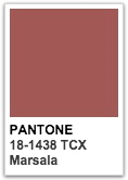
Pantone Color of the Year 2015
Marsala 18-1438
A naturally robust and earthy wine red, Marsala enriches our minds, bodies and souls. The impactful, full-bodied qualities of Marsala make for an elegant, grounded statement color when used on its own or as a strong accent to many other colors.

Pantone Color of the Year 2014
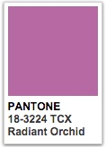
Radiant Orchid 18-3224
Radiant Orchid blooms with confidence and magical warmth that intrigues the eye and sparks the imagination. It is an expressive, creative and embracing purple—one that draws you in with its beguiling charm. A captivating harmony of fuchsia, purple and pink undertones, Radiant Orchid emanates great joy, love and health.

Pantone Color of the Year 2013
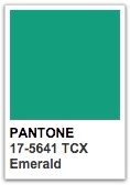
Emerald 17-5641
Lively. Radiant. Lush… A color of elegance and beauty that enhances our sense of well-being, balance and harmony. Most often associated with brilliant, precious gemstones, the perception of Emerald is sophisticated and luxurious.

Pantone Color of the Year 2012
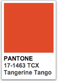
Tangerine Tango 17-1463
Reminiscent of the radiant shadings of a sunset, Tangerine Tango marries the vivaciousness and adrenaline rush of red with the friendliness and warmth of yellow, to form a high-visibility, magnetic hue that emanates heat and energy.

Pantone Color of the Year 2011
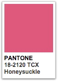
Honeysuckle 18-2120
Courageous. Confident. Vital. A brave new color, for a brave new world. Let the bold spirit of Honeysuckle infuse you, lift you and carry you through the year. It’s a color for every day – with nothing “everyday” about it. A dynamic reddish pink, Honeysuckle is encouraging and uplifting.

Pantone Color of the Year 2010
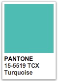
Turquoise 15-5519
Combining the serene qualities of blue and the invigorating aspects of green, Turquoise inspires thoughts of soothing, tropical waters and a comforting escape from the everyday troubles of the world, while at the same time restoring our sense of wellbeing.

Pantone Color of the Year 2009
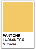
Mimosa 14-0848
The color yellow exemplifies the warmth and nurturing quality of the sun, properties we as humans are naturally drawn to for reassurance. Mimosa also speaks to enlightenment, as it is a hue that sparks imagination and innovation.

Pantone Color of the Year 2008
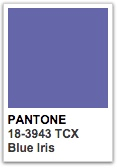
Blue Iris 18-3943
Blue Iris best represents color direction in 2008 for fashion, cosmetics and home products. As a reflection of the times, Blue Iris brings together the dependable aspect of blue, underscored by a strong, soul-searching purple cast.

Pantone Color of the Year 2007
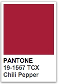
Chili Pepper 19-1557
This engaging, resonant hue strikes a high note for fashion and personal expression as its boldness is appealingly eye-catching, sophisticated and enticing. In a time when personality is reflected in everything from a cell phone to a Web page on a social networking site, Chili Pepper connotes an outgoing, confident, design-savvy attitude.
 Loading... Please wait...

